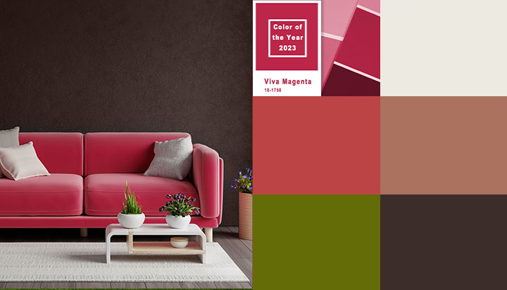
What’s new for colour in 2023? Calm and neutral is out, while daring and vibrant is in. Colour specialists working with interior designers say that warm-tinted, bold, and lively hues will become increasingly fashionable. That’s because people want colour for themselves as well as their homes. Let’s explain.
Employing brighter colours and using them in different ways is trending for home interiors, according to an insider at the Pantone Color Institute. He said that everyone has a need for artistic expression and that such fulfilment at home can only enhance a sense of joy and wellbeing.
People no longer hesitate to upholster sofas in multicoloured patterns or choose a daring paint colour for their dining room. Instead, they are considering how they may combine several colour themes to design a setting that is specifically tailored to them. Colour experts point out that selecting a more vibrant paint scheme may be the best approach to renew one’s home.
While selecting the ideal colour for you really comes down to personal choice, there are a few colour families that experts predict will become increasingly popular in the coming year. For those in need of motivation, here are six colour trends that, according to experts, will dominate 2023.
Magnificent Magenta
Despite originating from the red colour family, magenta has a unique, vivid personality that people will be drawn to in the coming year. Because of its joyful yet potent nature, the Pantone Color Institute selected Viva Magenta as its official colour of the year for 2023. Magenta is a red with faint purple undertones that harmonises beautifully with a wide range of colour schemes, from those on the lush, gemstone-hued region of the spectrum to even a milder, earthy palette.
In addition, Pantone says that a colour like Viva Magenta may survive in both the actual world and the virtual one, encouraging exploration as virtual reality becomes more pervasive in our daily lives.
Similar paint colours are Dulux’s Magic Magenta and Behr’s Artful Magenta.
Prominent Oranges and Reds
To declare “Raspberry Blush” as their official colour of the year, Benjamin Moore made a 180-degree turn from the calming hues of previous years. The choice indicates a larger trend in the interior design sector toward vivid colours.
Similar colours are Dulux’s Raspberry Ripple and Behr’s Raspberry Pudding.
After several years of neutrals and subdued hues occupying center stage, colour experts detected a craving for vibrant, saturated colour and a trend toward colours that are a little unconventional for 2023. According to them, the time felt perfect to draw attention to a shade that inspires a willingness to use colour to express one’s creativity and personality, even if doing so required departing from tried-and-true practices.
The red, orange, and terracotta families of colours in particular are predicted to experience a surge in popularity because they encourage people to step outside of their comfort zones and use colour more expressively. These colour families’ tones, especially the more vibrant reds and oranges, invigorate and uplift us.
Surprising Greens
Due to their ability to mimic nature, midtone greens have taken over homes all over the world. While Savannah Green, which was included in the company’s Color Trends 2023 palette, has established itself as a go-to neutral, experts think other distinctive greens are more likely to find a home.
Savannah Green is an excellent illustration because it has a lemony, acidic aspect that could be unexpected for a wall colour, but when applied in a room, it produces a place that is simultaneously lively and refined.
Similar tones are Dulux’s Safari Scene and Behr’s Alamosa Green.
Dosing your walls with electric chartreuse or forest green may sound daunting, but we guarantee the results will leave you stunned and inspired.
Enhanced Blush
While there is a vast array of vibrant colours to play around with, some people find neutrals to be a little bit dull. However, colour specialists frequently argue that these colours are crucial for creating a strong foundation.
Neutrals of today embrace a warmer disposition with earthy undertones as opposed to the previous, colder tones. In the coming year, blush-coloured paints are expected to become increasingly prevalent, according to paint manufacturers like Sherwin-Williams, who selected mauve-y Redend Point as their colour of the year.
Similar shades are Benjamin Moore’s Red Point Sand and Behr’s Red Potato.
Earthy Shades
Even though professionals note that nature will still be a major influence on colour trends through 2023, there is an interesting shift toward “more earthbound natural colours associated with craft,” particularly warm brown tones that are reminiscent of various kinds of woods, minerals, and even gems.
Tiramisu, a coppery, midtone brown that nicely encapsulates this trend towards organic tones, was named the colour of the year by C2 Paint. These hues provide a subtle foundation on which to build while grounding interiors in warmth and solidity.
Similar shades are Dulux’s Iris Mauve and Behr’s Tiramisu Cream.
Substitutes for Black
Although black will never go out of style, there are many other colours that may give a space a feeling of depth and elegance. Wenge, a dark chocolate with violet and black undertones, is recommended by Benjamin Moore as a fantastic substitute for black as part of their Color Trends Forecast.
Similar tones are Dulux’s Wilderness and Behr’s Wilderness.
Experts also point out that “earthbound violet tones” are becoming more and more fashionable. These rich hues of brown, purple, and green feel surprising and layered while carrying all the drama and power that black does.
Let the seasoned paint experts handle it
Since you’re spending a significant amount of time and money painting (or repainting) the interior of your home, let skilled painters complete the task to your specifications.
For all of your home’s painting needs in Greater Vancouver and the Lower Mainland of British Columbia, call Tall Guy Painting today at (778) 683-5397 for a free estimate.